Thursday, May 5, 2011

The Last Batch o' sketches and Artist #28

Artist 28 is a bit of a mystery, as I can't seem to find her actual name, so I am left with a screen name of tlc010. A wonderful artist, with wacky and zany lines, abstracted features and glorious photomanipulation talents. She is a fantastic story-boarder and illustrationist, with a heavy lean towards the humorous, which is something I always find wonderful when viewing someone's work. Most her work takes on incredibly exaggerated facial expressions and movements, creating large quantities of energy and movement around the image.


Yup.
Anyways, sketches.


Artist #27: Fiona Banner

“I got involved in looking at and describing the human form through watching war films. It occurred to me, after a while, that their images were pornographic in nature – both alluring, seductive and repulsive. That got me into looking at porn films. I began to think that they were like life drawings, only with all the rules broken. They have very limited narrative: often no script, virtually no dialogue, just the hovering gaze. I described these films moment by moment, in my own words, and made very big pictures from them. They take something very private and domestic, and make it heroic. After that, I worked with a striptease artist. She came to my studio and undressed, and I began describing her act verbally. It became a kind of striptease in words.”
-Fiona Banner (http://sk.aphelis.net/post/793479171/fiona-banner-almost-fluorescent-nude-2007)

Fiona Banner is a contemporary artist, with, in addition to her focus on the above, also seems to have a bit of love for airborne vehicles. Personally, I quite liked her "Snoopy vs. The Red Baron" exhibit pieces, as they bring me that bit of nostalgia that I love so much, and display a wide variety of mediums to depict her subject matter. To me they show that even something cute and harmless as Snoopy can be twisted to depict a more graphic scene, given just a hat and a premise. It shows how we as people all have a sort of love for this action, even though lives are stomped underfoot to obtain it.

http://www.fionabanner.com/works/index2.htm

Artist #26: Emmy Cicierega

Emmy Cicierega is yet another illustrationist with a love for smooth, clean linework and vector style shading. But, she also crafts jewelry. Really what sets her apart for me is that she operates on a similar basis of my own self. She draws things to make people smile and laugh, and spread a little joy.

Artist #25: Amy Donohoe

Amy Donohoe's art holds a heavy focus on lines, with an a style resembling caligraphy. Her strokes are long and fluid, with a tendency to use curves. Her illustration work varies depending on whether it is digital or traditional. Both use a vector style of shading with only very defined features inside the figure earning the right to be defined by lines, but her digital work tends to consist of very bright, uninterrupted colors, whereas her traditional work usually holds some signs of standard color shading.

http://www.flickr.com/photos/49104085@N07/sets/72157625822910896/

Artist #24: Kelly Hamilton

Kelly Hamilton is a multi-styled artist, crossing into different genres as well. Pixel art, simple 3D art, vector art and the more standard style of painting all are under her belt. The fact that her artwork moves through so many different styles makes it hard to identify things which are uniquely hers, though her paintings seem to be a bit grainy overall, and her linework tends to give things a soft, light feel. But this is lost on her traditional paintings, which give a much more realistic depth of feel to the piece through stronger contrasting shades and hues, with lines being more heavily accented by darker colors.

http://www.junglestudio.com/

Artist #23: Der-shing Helmer

Der-shing Helmer is an illustrationist and biologist, with a focus in his art on figures. His knowledge of animals and wildlife also appears in a portion of his art, creating an interesting blend between his knowledge of the interworks of the subjects he draws and his own cartoonish style. His figures bear a simplified anatomy with large and energetic linework. His color choice seemed to be steeped in more organic colors, with a distinct lack on anything feeling mechanical or muddied.

Artist #22: Kari Byron

Kari Byron is a sculptor, and more commonly recognized as the female member of the Mythbusters team. Her mediums of choice are, as listed upon her site: polymer clay, found objects, acrylic gouache, wood, and metal. Her main focus seems to be on the human face and form, abstracted a bit and placed into a surreal environment. In pieces which she breaks from that, there is still usually one very recognizable object within the piece to pull you in as you examine what sits tied around it.

http://www.karibyron.com/

More sketches!


Tuesday, May 3, 2011

Artist #21: Frank Culver

Frank Culver from Oceanside California is a potter and painter, whose main surface of choice is skateboards and surfboards. His painting work fluctuates between figures and non-representational, with some places in between. His line art is very soft usually, with thin or implied lines created through color meeting with another.

His pottery is varied, from simple pots, bowls and vases, to abstract creations, generally utilizing organic forms. He doesn't use much color, and only a very light - if at all- glaze to keep the rough-yet-smooth feel of the clay.

Artist #20: Ansel Adams


I hope that my work will encourage self expression in others and stimulate the search for beauty and creative excitement in the great world around us.

- Ansel Adams

Artist #19: Eiichiro Oda

Eiichiro is a manga artist, mainly known for his work on One Piece. He is a younger artist, drawing heavy inspiration from eastern cartoon art styles. His work utilizes a simplistic vector style of shading, with heavy lines to create forms, and thinner lines for details such as scratches or bruises. His art is fairly standard for manga, and not overly compelling to look at, but his ideas and imagination used to create amazing characters and interesting scenery make his work fun and interesting to look at.

Artist #18: Chris Sanders

Chris Sanders is an artist aboard the Dreamworks crew, and formerly with Disney. He is mainly known for his work in Lilo and Stich, in which his art was used for direction, but also contributed to the Lion King, Beauty and the Beast and the Rescuers Down Under. His creations are zany, yet adorably and his line work sports a distinct lack of any jagged edges or perfectly straight lines.

Sander's colors tend to be smooth gradients and very light colors, with blacks for extreme dark. Similar in style to that of most comic books. These light colors give his work a very warm, playful feel, even when using colors of a cooler spectrum, a la blue or green.

Artist #17: Stanley Lau

Lau is another digital artist, whose focus shifted to such after a long period of using traditional mediums. He chose his career after his two years training in the Chinese military, and many years of encouragement in prior schooling. What most attracted me to Lau's work, is what he calls the Pepper Project.

He created this project himself to test himself, drawing one thing in as many styles as he could possibly dream up and see around him. In this case, a lady named Pepper. From photo-realistic to chibi, he has covered an unbelievable amount of differing styles of drawing and painting this single character. His variety in color choice and the usage of those colors is incredibly inspiring.

Artist #16: John Kascht

John Kacsht is a charicature artist who uses a variety of mediums, with finalized pieces usually being in black ink or watercolor. "The exaggerated features emphasize portions of the actual persons character," He states in a video of the process he undergoes to create his charicatures (found HERE).

His use of gradient shading creates a wonderfully realistic-- if fairly askew-- portrait of an individual. He generally leaves out a background, only incorporating things on the character and slight foreground so nothing detracts from his emphasis on the portrait. To reach the final form of his project, he creates numerous sketches, from all angles, and has upon occasion used clay to get a feel for the entirety of the head he wishes to represent.

Thursday, March 24, 2011

Artist #15: Paul Robertson


Paul specializes in pixel art animation, and does an amazing job of it I'd say. His medium is that of the digital, creating classic sprites from the 16-32bit era, with stylized figures and wild creations that work to create a feeling of nostalgia for an age passed. His art is fun and entertaining to behold and watch. His style is heavily influenced by eastern style anime, with subject matter mainly focused on figures, with bits pulled from numerous entities to create his creatures.

Moltov Man

The legal battle between Joy Garnett and Susan Meiselas has created a lot of controversy over a single picture of a single man, whose name has been lost as his image has become the icon of rebellion and revolution. The capturing of the raw emotion of anger captured by both the artists provides a perfect image of what the anger and rage felt by the oppressed looks like, and allows others to get a feel for it. The man's action immortalized his image, the icon even being re-printed in Nicaragua for the anniversary of the revolution, and painted on walls to symbolize the same. The symbol of the Moltov Man took a deep root in society, whereas his name has simply fallen from the page.

Artist #14: Richard Serra

Serra has an interesting form of 3D art, involving the twisting of thin, long, tall pieces of metal into organic curving lines, or simple geometric forms. He has also used molten lead, in a more Jackson Polluck style, as well as rubber and fiberglass, all mediums which are rarely, if ever, used. Generally he seems to place his work in with sheet metal in a enclosed or very wide space where people are forced to walk by, being dwarfed by the massive pieces of metal.


His choice of metal and the way he uses it sports a heavy influence from the earlier mentioned Polluck, as well as many of the other abstract artists from the time. His work gives the same feeling of "energy and raw physicality", as his Art21 biography puts it. Some of his material, like the lead, also have a time based quality, changing as years pass to settle and take on a different sheen that they originally held.

Artist #13: Pendleton Finn Ward

A newcomer to the land of animation, Pendleton Ward always succeeds in bringing a smile to my face with his zany ideas and colorful worlds. None more so than Adventure Time, which has lured me back into cartoons with colorful, expansive lands to wander, and dark, deep dungeons abound. It's like my childhood wrapped in a colorful, package of pure amazing.


The art is simple, colors are solid, with shading only present in situations of extreme light or dark. It's a style that reminds me of my drawings in grade school, but done with such eloquence you can't help but smile. Pendleton expresses his knowledge of his audience through this show, hitting exactly where and how it should.

Artist #12: Hayao Miyazaki

The first movie I can recall seeing, in full detail, is My Neighbor Totoro by Hayao Miyazaki. It was bright, fantastical, and told a wonderful story. All of the movies this man has produced have had a profound effect on me and my art. No matter how dark the stories seemed to get, they were always light-hearted, and filled with fun adventures. They way he can capture emotion in his characters and the magnificent landscapes he creates always leave me slack-jawed and longing for more.

Calm, serene settings and warm colors help to amplify the feelings of happiness in his work, along with his ability to capture facial expressions perfectly serve to amplify the warm-hearted tale he tells. Even his blues and other cool colors are lined with light and smooth, wavy edges to keep the calm atmosphere. When he does bring forward a darker mood, the darks accompany, blacks becoming deeper and more expansive before being gently pushed back by light as a scene plays through. His work is always a treat to behold, and his animations and art serve to drive me forward and remind me why I love the world of art so much.

Artist #11: Jeff Koons

I have trouble seeing Jeff Koons as an artist. I certainly acknowledge his pieces as art, but I don't feel they're really his per se, since he doesn't actually work the material to make what he does. To me art is about having the knowledge to make something with your own hands, and being practiced enough to do it better than the vast majority. If someone thinks of an idea for a statue, and asks a sculptor to craft it, it may belong to the buyer, but it is still the artist's work. To me, Jeff owns the art, but the art is not his own. Perhaps this is part of what he is trying to do, but I simply don't think he is deserving of having his name placed as a creator of the work.

Artist #10: Clive Barker

While writing for a long, long while, Clive Barker discovered painting in his mid/late 30's. I was unaware that he had come into the art world until last night after watching an interview with him at his studio. In it, he discussed the reason he loved art, which went along extremely well with my own feelings about the subject. He makes art because it's a way for him to clear his mind and get all his ideas laid out for others to see and contemplate. He tries to show what he has learned about the world through his art, and hopes to offer a glimpse into dark and fear from the safety of a well lit room. His wild lines and frenzied paint offer a high level of energy with a great contrast between colors, creating wonderful works of art for ones eyes to simply soak up and admire.

Wednesday, March 23, 2011

Artist #9: Doug TenNapel

Doug is a comic book artist whose career really kicked off after developing one of my favorite characters of all time, Earthworm Jim. Originally, he started in the video games industry, branching out into comics after he has some success with the afore mentioned Jim and a game he developed afterward called Neverhood, a unique game which utilized claymation for it's graphic art.

His wacky imagination is what sets him apart from most artists from the same genre in my mind. He creates interesting and original characters with bits, which serve as great inspiration to myself. He breaks away from the normal use of the serious, muscular, perfect bodied heroes, using wonky anatomy and geometric lines to almost run a parody on what most consider appropriate for a comic book hero.

More Sketches

To provide a quick respite from the more famous of artists and their finished products, here are some doodles and sketches.

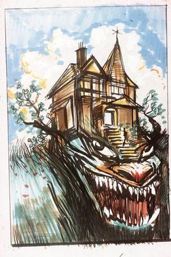
Dry Erase Marker on whiteboard!Sharpee!
Pen!

Aaaand Tablet.

Artist #8: Henry Moore

Henry Moore sports an interesting take on figure sculpting. He goes to it with a more abstract approach, creating weaving, organic shapes that seems to capture human figure and motion. Some are a bit more obvious than others, depicting things which can be more easily understood, such as the neck and arms of the figure below.


And then there are the harder to read ones. Sculptures that definitely bear the same rounded curves and essence of movement, but are much harder to see the figure in, if it exists within the piece at all even.

Artist #7: Vick Muniz

I first learned of Mr. Muniz my senior year in high school, as our art teacher had taken quite a fancy to his work. I quickly followed suit after seeing a video about his work and his life. And while his life is quite the tale, it's the sheer volume of mediums within his work that drew me in. Chocolate, spagetti, wire, thread, cotton, rocks, pencil, and the landscape itself. If you can think of it, Vick's probably done something with it. And not only that, but done it well.

As I simply cannot find the words to aptly describe his work, I searched out someone who could. Someone from Criticalmob.com named Adriana Szkolnik, who states, "Muniz experiments with iconic imagery recaptured in different formats, designating artificial reality to already frequently-copied artwork. In his best-known process, he replicates familiar pieces using everyday materials like sugar, chocolate syrup, dust and diamonds, then photographs them; these photographs, not their painstakingly assembled subjects, are his true artworks."

Artist #6: Yoshitaka Amano

As a boy, I had no idea who this man was designing characters in some of my favorite games and shows, but I loved his art. His unique character designs and the soft energy that he binds to paper always leaves me with mouth agape and eyes wide.


His style is reminiscent of early Japan and Chinese artists such as Kano Maotonobu or Shen Zhou, albeit, with more of a focus on figures than landscape. They sport lively, thing, flowing brush strokes and lines to create a light feel, even with the darkest of color. His work spans animations, games, books and galleries all about the globe, and he serves as an excellent roll model for aspiring illustrators everywhere.

Monday, March 14, 2011

Artist #5: Bill Waterson


Bill Waterson has a large part in my pursuit of the arts. As a younger lad, I gathered up all his Calvin and Hobbes books over a year, and practically drowned myself in the world he had created. His amazing use of watercolor and quick ink lines always bring a smile to my face, and have had a great impact upon the reason I choose to be an artist.

Waterson has explored many styles, and has a unique way of blending them all together into a single work. In this case, a comic strip. Whether it be noir, cubist, or realism, he tied it all together nicely, weaving a story from images alone on occasion. All of his works have a lighthearted air to them, and it's something I hope to make prominent in my work as well.

Sunday, March 13, 2011

Artist #4: Tom Friedman

I must admit that my knowledge in and of the 3D arts is very sub-par. While there are a lot of interesting pieces within a three-dimensional plain thrown about, I hadn't really found one whose work as a whole really stood out to be. Perhaps it was because I hadn't really searched for it, but when entering this class, we were quickly introduced to Tom Friedman, and I was quite enamored with his work. Through his meticulous and repetative folding, bending, cutting or binding of objects, he has created attractive pieces both conceptual and figurative.

I find his patience for working with all the differing mediums impressive, to put simply. Paper, wood, aluminum foil and hair just to name but a few. I find it rather inspiring to simply look at his work and wonder at how many hours he spent slowly putting together things such as the toothpick starburst. His understanding of the various items he chooses to use never ceases to impress me, and has led me into wanting to learn a bit more about artists who off operate off flat dimensions.

Wednesday, March 9, 2011

Artist #3: Julian Beever

Julian Beever is a man who focuses on the medium of chalk. What is unusual about this is the surface which he uses for application. The sidewalk. With his knowledge of how the eye works, he produces images in tromp l'oeil style. To do this, he stretches the image out to gigantic
proportions, as can be seen below.


His art ranges in what is displayed, from simple product placement to funny concepts and ideas. His art always holds a bright, jovial tone to it, and is always reflected by the smile on his face. To me, art is about having fun making something great, and Julian Beever serves to display that perfectly.

Artist #2: Dan LuVisi

Dan LuVisi is yet another digital artist whom has been a great inspiration to myself, and many others. His knowledge of form and figure, and great application of color, light, and how they both play off each other are simply fantastic, and his realistic style really brings his unreal creations to life, almost to the point of resembling an actual photograph.


Hours of work are what bring his works to life, with hundreds of textures and layers of color. His obsession with creating the smallest of details is what really makes his work, to me, stand out from the others. Taking time to make each stitch on the pouch, every wrinkle of cloth and every little spatter of blood give his creations a unique personality and atmosphere that I find utterly entrancing.

Tuesday, February 8, 2011

SKETCHES

Sketches! Tons of them! All photographed via webcam as the scanner has decided it would be best not to work today, and even then, is not big enough to properly scan the entire page. And so my hunt for a decent digital camera begins.

Sketches are from Jan 17 -29th, in no particular order