
Tuesday, May 3, 2011
Artist #19: Eiichiro Oda
Eiichiro is a manga artist, mainly known for his work on One Piece. He is a younger artist, drawing heavy inspiration from eastern cartoon art styles. His work utilizes a simplistic vector style of shading, with heavy lines to create forms, and thinner lines for details such as scratches or bruises. His art is fairly standard for manga, and not overly compelling to look at, but his ideas and imagination used to create amazing characters and interesting scenery make his work fun and interesting to look at.

Artist #18: Chris Sanders
Chris Sanders is an artist aboard the Dreamworks crew, and formerly with Disney. He is mainly known for his work in Lilo and Stich, in which his art was used for direction, but also contributed to the Lion King, Beauty and the Beast and the Rescuers Down Under. His creations are zany, yet adorably and his line work sports a distinct lack of any jagged edges or perfectly straight lines.
Sander's colors tend to be smooth gradients and very light colors, with blacks for extreme dark. Similar in style to that of most comic books. These light colors give his work a very warm, playful feel, even when using colors of a cooler spectrum, a la blue or green.

Sander's colors tend to be smooth gradients and very light colors, with blacks for extreme dark. Similar in style to that of most comic books. These light colors give his work a very warm, playful feel, even when using colors of a cooler spectrum, a la blue or green.

Artist #17: Stanley Lau
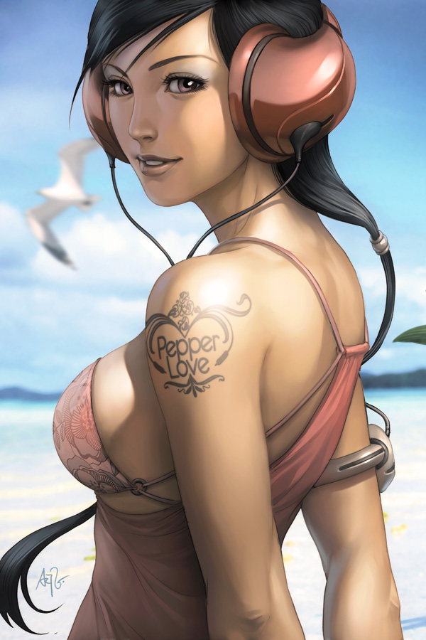
Lau is another digital artist, whose focus shifted to such after a long period of using traditional mediums. He chose his career after his two years training in the Chinese military, and many years of encouragement in prior schooling. What most attracted me to Lau's work, is what he calls the Pepper Project.
He created this project himself to test himself, drawing one thing in as many styles as he could possibly dream up and see around him. In this case, a lady named Pepper. From photo-realistic to chibi, he has covered an unbelievable amount of differing styles of drawing and painting this single character. His variety in color choice and the usage of those colors is incredibly inspiring.

He created this project himself to test himself, drawing one thing in as many styles as he could possibly dream up and see around him. In this case, a lady named Pepper. From photo-realistic to chibi, he has covered an unbelievable amount of differing styles of drawing and painting this single character. His variety in color choice and the usage of those colors is incredibly inspiring.
Artist #16: John Kascht
John Kacsht is a charicature artist who uses a variety of mediums, with finalized pieces usually being in black ink or watercolor. "The exaggerated features emphasize portions of the actual persons character," He states in a video of the process he undergoes to create his charicatures (found HERE).
His use of gradient shading creates a wonderfully realistic-- if fairly askew-- portrait of an individual. He generally leaves out a background, only incorporating things on the character and slight foreground so nothing detracts from his emphasis on the portrait. To reach the final form of his project, he creates numerous sketches, from all angles, and has upon occasion used clay to get a feel for the entirety of the head he wishes to represent.

His use of gradient shading creates a wonderfully realistic-- if fairly askew-- portrait of an individual. He generally leaves out a background, only incorporating things on the character and slight foreground so nothing detracts from his emphasis on the portrait. To reach the final form of his project, he creates numerous sketches, from all angles, and has upon occasion used clay to get a feel for the entirety of the head he wishes to represent.

Thursday, March 24, 2011
Artist #15: Paul Robertson

Paul specializes in pixel art animation, and does an amazing job of it I'd say. His medium is that of the digital, creating classic sprites from the 16-32bit era, with stylized figures and wild creations that work to create a feeling of nostalgia for an age passed. His art is fun and entertaining to behold and watch. His style is heavily influenced by eastern style anime, with subject matter mainly focused on figures, with bits pulled from numerous entities to create his creatures.

Moltov Man
The legal battle between Joy Garnett and Susan Meiselas has created a lot of controversy over a single picture of a single man, whose name has been lost as his image has become the icon of rebellion and revolution. The capturing of the raw emotion of anger captured by both the artists provides a perfect image of what the anger and rage felt by the oppressed looks like, and allows others to get a feel for it. The man's action immortalized his image, the icon even being re-printed in Nicaragua for the anniversary of the revolution, and painted on walls to symbolize the same. The symbol of the Moltov Man took a deep root in society, whereas his name has simply fallen from the page.


Artist #14: Richard Serra
Serra has an interesting form of 3D art, involving the twisting of thin, long, tall pieces of metal into organic curving lines, or simple geometric forms. He has also used molten lead, in a more Jackson Polluck style, as well as rubber and fiberglass, all mediums which are rarely, if ever, used. Generally he seems to place his work in with sheet metal in a enclosed or very wide space where people are forced to walk by, being dwarfed by the massive pieces of metal.
His choice of metal and the way he uses it sports a heavy influence from the earlier mentioned Polluck, as well as many of the other abstract artists from the time. His work gives the same feeling of "energy and raw physicality", as his Art21 biography puts it. Some of his material, like the lead, also have a time based quality, changing as years pass to settle and take on a different sheen that they originally held.


His choice of metal and the way he uses it sports a heavy influence from the earlier mentioned Polluck, as well as many of the other abstract artists from the time. His work gives the same feeling of "energy and raw physicality", as his Art21 biography puts it. Some of his material, like the lead, also have a time based quality, changing as years pass to settle and take on a different sheen that they originally held.

Subscribe to:
Posts (Atom)